

select search filters
briefings
roundups & rapid reactions
Fiona fox's blog
The Office for National Statistics (ONS) have published an article looking at all-cause mortality in different European countries in 2020 as a comparable indicator of the impact of the coronavirus pandemic.
Nigel Marriott FRSS, Independent Statistician, said:
“I’ve taken a look at the ONS relative cumulative age standardised mortality rates for the whole of 2020 and broken it down by age and gender for the 4 countries with the highest rates. This provides some interesting finding.
“When you look at the UK, the cumulative age standardised mortality rate is consistent at 8% across age within gender. Basically the differences in the UK are driven by gender.
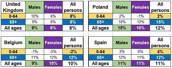
“But when you look at the other 3 countries that have the highest rates, there is a difference between the two age groups but not gender in Spain & Belgium and with both age & gender in Poland. Looking at other countries in Europe the UK stands out here for the similar rate for the different age groups and a greater gender divide.”
Prof Kevin McConway, Emeritus Professor of Applied Statistics, The Open University, said:
“Counting Covid deaths is a necessary but unpleasant task. Contrary to what’s sometimes written, we statisticians do think about the individual suffering involved for patients, families, loved ones, health and care workers – it’s not just numbers. But it’s an important task, and not a straightforward one. Countries do publish figures for deaths caused by, or associated with, Covid-19. But even in England I can think of at least four different definitions of deaths associated with Covid-19 in different official statistical sources, and there were others in the early stages of the pandemic. These days, the different counts in England don’t differ all that much, and they generally move more or less in lockstep and show the same trends – but again, that wasn’t always the case in the early stages. But other countries use definitions that differ much more. In the UK alone, there are some small differences between definitions in the four countries, but using the official counts of Covid-19 deaths from countries across Europe would lead to some major anomalies.
“Therefore, statisticians, epidemiologists and demographers do generally favour the use of measures of excess deaths and excess mortality. To get such a measure, the idea is to count how many deaths from any cause, not just Covid-19, actually occurred in a given period of time, and to compare that count with the number of deaths that would be expected to have occurred in that period of time, based on data from previous years (before the pandemic). For European countries, this does not involve having to make potentially awkward choices of what counts as a death related to Covid-19. All European countries, and many others across the world, have had reliable systems for registering and counting deaths for many years – going back into the 1800s in many places. There are still choices to be made about exactly how excess deaths should be calculated (see below) but the data exist to allow the calculations to be done in a consistent way across the continent. As well as avoiding conflicting definitions of Covid deaths, using excess deaths includes deaths that are caused indirectly by the pandemic. For instance, if someone dies from an unrelated medical condition because healthcare facilities in their city were overwhelmed by Covid-19 cases, that would not generally be counted as a Covid-19 death, but it would add to the count of excess deaths just as it would if the person had succumbed to a SARS-CoV-2 infection. There can be issues over timing – if someone’s cancer diagnosis is delayed because the hospitals are full of people with Covid-19, and they later die, that sad event might well not occur until a long time after the pandemic peak. But for most purposes, excess deaths are the best measure we have.
“The report itself presents a huge number of interesting comparisons and trends. The interactive diagram (Figure 2) is excellent for showing how the pandemic spread across the continent, and how different waves hit different regions at different times, particularly in the autumn. I won’t comment on these details, interesting as they are, apart from the following aspects. The first wave of the pandemic did occur at very roughly the same time across Europe, and then (up to the end of June) excess mortality was higher in UK, and specifically in England, than in all the other countries included in the comparison. (This is in Table 5 in the report.) But by mid-December, the position had changed, with the UK falling further down this dreadful league table. To some extent, though, that is because the high mortality in the UK in the second wave did not really occur until after mid-December, and so is not included in that particular comparison at all. By late June, mortality in the UK was 6.7% above the five-year average for 2015-2019, but by mid-December this had gone up only to 7.2% above average. These are cumulative figures for the whole of 2020 up to the date in question, so they indicate that there was not a great deal of excess mortality in the UK between the end of June and mid-December In several countries in central and eastern Europe, and in Spain, there were serious waves of Covid-19 infection and deaths in the autumn, so their rates went up between June and December in a way that did not happen here till after then end of 2020.
“But more interesting, and in a way harder to explain, is the position of the UK in the lists of excess death rates up to mid-December when split up by age (Table 6). Here, for people aged up to 64, Bulgaria has the worst record across the year to mid-December, with death rates 12% above average. But the next places down the table are taken up by the UK and its four constituent countries (which are included separately as well as the figure for the whole UK). The UK countries are much further down the table for deaths in people aged 65 and over. In most countries apart from the UK and Bulgaria, deaths were proportionally much higher above average in the 65+ group than they were for younger people. For instance, in Poland, deaths were 15% above for people aged 65+, but only 1% above average for those under 65. The corresponding figures for Spain were 12% above average for the 65+ age group, and 4% for younger people. In the UK deaths were 7% above average for 65+ and 8% above for younger people. So, in comparison to nearly all other European countries, the UK had relatively high excess death rates in younger people. The information in this report can’t tell us why. Excess deaths rate don’t tell us what actually caused these deaths, and because all the comparisons are with the 5-year average rate for the corresponding age group, they don’t tell us how death rates in older people compare with those in younger people. (I mean, we know how much higher the death rate for 65+ is than the five-year average for 65+, and we know how much higher the 0-65 rate is than the average rate for 0-65, but we don’t know from those figures how the rates in 65+ and 0-65 compare with one another.) In all these countries, death rates from all causes for over 65s are much higher than death rates from all causes for under 65s (as shown in the ADSR tables in the linked ONS dataset). This report can’t tell us whether the same is true for deaths actually due to Covid-19, but doubtless the patterns are broadly the same as in the UK, with much higher death rates in older people. So the difference in relative death rates by age, found here, could be because mortality directly caused by Covid-19 in younger people was relatively higher here than elsewhere in Europe, or it could be because excess deaths from non-Covid causes were relatively higher here than elsewhere, or some combination of the two. For that we’d need data on the actual causes of death – and then we’d be right back into the issue that Covid-19 deaths are defined differently in different countries.”
Further information
“ONS have chosen to calculate and compare excess deaths, in this report, using quantities called relative cumulative age-standardised mortality rates (rcASMRs), and in some parts of the report they present these separately for males and females, and for very broad ages groups (0-64 and 65+). This is a complicated terms, so I’ll take it apart. A mortality rate is calculated by dividing the number of deaths in a period by the population of the country, city, or area concerned, to get a number of deaths per 100,000 population. These rates can be age-standardised to allow for differences in the patterns of ages in different countries and regions. If that wasn’t done, one country or city might have a higher mortality rate than another simply because its population is older. Then the ‘relative’ part means that the rates have been compared with five-year average rates from 2015-2019. If the resulting rate is greater than zero, this means that the death rate in that period is higher than the average for those five years, and if it is less than zero, then there were fewer deaths in relation to the population than there were in those five years. Finally the ‘cumulative’ part means that the rates are combined over a longer period, since the start of 2020, rather than looking simply at single weeks as is done in much of the rest of the report and data file.
“This is not the only way to measure excess deaths, though in my view it is a very appropriate way to do it for the types of comparison made here. For example, some other researchers have used more complicated statistical models to give a baseline with which to compare actual numbers of deaths – but in my view the age standardisation takes adequate account of the important differences between countries and times. It’s worth mentioning, though, that this isn’t the same method that ONS use in calculating excess deaths in their weekly report on death registrations in England and Wales. They use a simpler method, which is fine in that context because they are only looking at one pair of countries and their populations have not changed much.
“Though ONS, and Eurostat who have provided most of their data, have taken great care to obtain consistent data on all countries included, this can never be perfect. One fairly unimportant aspect is that data for most countries count deaths on the basis of the date when the person died, but the UK (and Armenia) instead count on the basis of the date the death was registered. But a bigger issue is the lack of data on Germany. This is because the age standardisation process requires data on the age and gender of the people who die, not just a count of how many died. Germany does provide such data, I understand, but only a long time after the deaths have actually occurred. In the past they have justified this on the basis that they want to be sure that the data are very accurate before releasing them. Every other country releases provisional data much more promptly (though not all as promptly as in the UK), on the grounds that it’s better to have useful data fairly rapidly, to pick up trends and differences as soon as practicable, even if some of the numbers might have to be adjusted later (and, generally, any such adjustments tend to be pretty small).”
https://www.ons.gov.uk/releases/comparisonsofallcausemortalitybetweeneuropeancountriesandregions2020
Declared interests
Prof Kevin McConway: “I am a Trustee of the SMC and a member of its Advisory Committee. I am also a member of the Public Data Advisory Group, which provides expert advice to the Cabinet Office on aspects of public understanding of data during the pandemic. My quote above is in my capacity as an independent professional statistician.”
None others received.